How To Customize
Customizing your acrylic product online is quick and easy. Select a product type, choose the size and material, add your custom text or artwork, and then preview the design to see exactly how it will look. When you're happy with your design, just place your order and we'll take care of the rest.

Step-by-Step Online Customization Process for Acrylic Products
Designing a user-friendly customization flow for acrylic products involves guiding the customer through clear stages – from choosing a product type all the way to previewing their design and placing an order. The process should be broken into manageable steps so as not to overwhelm the user. Below is a numbered guide outlining each stage of the journey, along with UI/UX best practices (like progress indicators, tooltips, live previews, mobile-friendly design, and dynamic pricing) integrated at each step:
Step 1: Select Product Type (Category)
The first step is to let the user choose what type of acrylic product they want to customize. Present a selection of product categories – for example:
- Signage (e.g. office signs, retail signs)
- Display Cases (clear acrylic boxes or stands)
- Awards & Trophies (plaques, accolade trophies)
Provide visual thumbnails or icons for each category to make the choice obvious and engaging. This step establishes a guided wizard flow – only this choice is active at first, signaling a clear starting point. A progress indicator or breadcrumb can show this as the first stage (e.g. “1 of 9”) to give users a sense of progression. Once a category is selected, the interface should load the next step.
(UI/UX Best Practice – Guided Steps: By breaking the configurator into clear steps, users feel a sense of accomplishment at each stage and aren’t overwhelmed by too many options at once. Display only the current step while allowing navigation back to prior steps if needed. Visually mark completed steps as done to orient the user.)*
Step 2: Define Shape and Dimensions
Next, gather the user’s size and shape preferences for the chosen product. This step typically includes:
- Shape Selection: If applicable, let the user choose a shape (for flat signage, options might include Rectangle, Square, Circle, Oval, or even a custom contour shape). For trophies or cases, shape might be predefined (e.g. a specific award design or a standard box shape). Provide a simple graphic or outline for each shape option so the user can recognize it. If custom shapes are allowed, explain how they can provide a design or choose a template shape.
- Dimensions Entry: Provide input fields (with units) for width, height, and any other relevant dimensions. For a rectangular sign, for example, the user would input width and height; for a display case, length × width × height; for a circular sign, a diameter. Use dropdowns or toggles for units (inches, cm) if needed. The UI can include sliders for common size ranges or preset size buttons (small, medium, large) to simplify selection.
- Orientation (if relevant): If the shape can be oriented (portrait vs landscape), include a toggle or automatic detection based on entered dimensions.
As the user enters dimensions, validate inputs in real-time. For instance, enforce minimum and maximum size limits (and show an error message or red highlight instantly if the entry is out of range). Only allow numeric input and perhaps step increments to avoid mistakes. If certain shapes enforce aspect ratios (like a circle only needs one value), adjust the UI accordingly when that shape is chosen.
Throughout this step, you can show a simple preview outline that updates to reflect the chosen shape and size – e.g. a rectangle outline that grows or shrinks as the user changes width/height. This gives immediate visual feedback. If the product type is something like an award with a fixed shape, display a placeholder image of that item at the specified size.
(UI/UX Best Practice – Real-Time Validation: Provide immediate feedback on dimension inputs to prevent errors. Highlight invalid entries (e.g. numbers beyond allowed range) with clear messages so users can correct them on the fly. This reduces frustration and keeps the customization process smooth.)*
Step 3: Choose Material Color/Tint (Acrylic Properties)
In this step, the user customizes the material aspects of the acrylic itself, such as color or tint (and possibly thickness, if the site offers different sheet thicknesses). Provide options like:
- Acrylic Color/Tint: Common choices include clear (transparent), frosted/semi-transparent, or opaque colored acrylic. If offering colored acrylic, show color swatches or small thumbnails for each available tint (e.g. clear, frosted, white, black, or various translucent colors like blue, red, etc.). The user can select one and the selection should highlight visibly.
- Material Thickness: If relevant, let the user pick the thickness of the acrylic sheet (e.g. 1/8″ vs 1/4″). This could be a dropdown or buttons. Thickness might affect durability and price, so if it’s an option, display any guidance (for example, “1/4″ recommended for larger signs to prevent bending”).
- Other Material Options: For certain products, there might be options like UV-resistant acrylic or mirrored acrylic. Include those as checkboxes or extra selections if applicable.
When the user selects a color or tint, update the product preview immediately to reflect that choice. For example, if they choose a frosted acrylic, the preview might show a translucent white effect; if they choose a blue tint, the preview outline or image takes on that tint. This instant feedback helps users see what they are getting. If thickness affects the appearance (usually it doesn’t visually, except edge thickness), you may not show it in the preview, but you can update any descriptive text or price accordingly.
(UI/UX Best Practice – Use Visual Swatches & Live Update: Present color/tint options visually, and whenever the user changes the material or color, reflect that change on the product image or preview without delay. This reassures the user that the selection is applied and helps them make informed decisions about appearance.)*
Step 4: Select Finish (Glossy, Matte, Frosted Surface)
Now, allow the user to choose the surface finish of the acrylic. Acrylic products often come in different finish styles, primarily: glossy, matte, or frosted. Provide these as clearly labeled options, each with a brief description or image:
- Glossy Finish: Shiny, reflective surface. Colors appear vibrant and the surface has high shine (great for a modern, eye-catching look).
- Matte Finish: Non-reflective, diffuses light. It reduces glare and gives a subtler, professional look (text is easier to read under bright light due to no glare).
- Frosted Finish: Semi-translucent, etched-glass look. It provides an elegant, diffused appearance – often used for a soft, upscale effect.
Let the user pick one finish. If possible, include a small preview image showing the difference (e.g. an icon that simulates light reflection vs diffusion). Because finish terms can be confusing, include tooltips or info icons next to each finish option – when hovered or tapped, these can explain the characteristics (“Glossy = high shine, reflective” etc.). This helps users make an informed choice without leaving the page.
(UI/UX Best Practice – Contextual Help: Provide quick explainers for technical choices. Small “ℹ️” icons or tooltips for terms like frosted or matte can educate users right on the spot. This avoids overwhelming them with big blocks of text, instead offering help only if needed, and keeps the interface clean.)*
Step 5: Choose Edge Style
For acrylic products, the edge finishing can be an important customization, especially for signs, plaques, or awards. In this step, allow the user to select an edge style. Options might include:
- Standard Cut Edges: The default cut edge, typically straight and not highly polished. (Often has a subtle matte/frosted look on the edge from the saw or laser cut.)
- Polished Edges: Edges that are flame-polished or diamond-polished to be smooth and crystal-clear. This gives the piece a shiny, glass-like edge finish for a more professional look.
- Beveled Edges: Edges cut at an angle (e.g. 45° bevel or rounded corners), adding an elegant framed effect. Beveled edges can enhance depth and catch light, often used for awards or premium signs (a refined, decorative touch).
Use images or diagrams if possible to illustrate each edge type, since this is a visual detail. For example, an icon showing a cross-section of a beveled vs. straight edge could be helpful. Again, tooltips or short descriptions should clarify the differences (e.g. “Beveled: edges cut at 45° angle for decorative effect”). If an edge style affects price (polishing might add cost), make sure the price preview updates accordingly when selected.
(UI/UX Best Practice – Visualization: Because edge styles might be hard to imagine, providing a visual indicator (even a small cross-section graphic) next to each option can help. Ensure the selection is clear (highlight the chosen style) and use short labels. If a user skips this, you might default to standard edges.)*
Step 6: Select Mounting & Hardware Options (Optional)
In this step, the user chooses any mounting or hardware preferences for how the acrylic product will be installed or displayed. Not all users need this, so make it optional if appropriate, or skip entirely for product types where it doesn’t apply. Common options include:
- Drilled Holes for Mounting: For acrylic signs or panels, offer pre-drilled holes. You can let the user specify the configuration (e.g. holes in each corner, top-center & bottom-center, only top two corners, etc.). A dropdown or illustrative diagram can help them choose. If “no holes” is an option (for those who will use velcro or frames), include that too.
- Standoff Hardware: If holes are selected, you might upsell standoff mounts – decorative bolts that hold the sign off the wall. For example, “Include 4 aluminum standoff mounts” as a checkbox. (The UI can show a photo of what a standoff looks like for clarity.) This goes hand-in-hand with drilled holes for wall mounting.
- Adhesive/Mounting Tape: Offer adhesive strips or foam tape for those who don’t want to drill holes. This could be a checkbox like “Include double-sided mounting tape”.
- Easel or Base Stand: For items like awards or panels that might sit on a desk, an optional acrylic base or easel stand can be offered. E.g., “Add a clear acrylic base for tabletop display.”
- Hanging Hardware: If relevant (for example, hanging signs), options could include hooks, chains, or suction cups for window hanging. Only show these if it makes sense for the selected product type.
The UI for hardware might be a series of checkboxes or toggles, each with a brief description and perhaps an image (e.g. a small image of a standoff or a wall-mount tape). The user can mix and match if appropriate (or some choices might mutually exclude others, which you’d enforce logically). This step ensures the user gets all the accessories they need for installation.
(UI/UX Best Practice – Conditional Options: Show hardware options relevant to the chosen product. For example, if the user selected a display case, the interface might show mounting brackets or locks instead of standoffs. Keep the interface smart: skip or simplify this step if not applicable. When offering hardware, make it clear what each item is – an icon or photo with a one-line description is ideal. Tooltips can again be used for any technical terms.)*
Step 7: Add Custom Text and Artwork
Now the user customizes the design content on the acrylic product. This stage is typically an interactive design interface or form where they can input text, choose fonts, and/or upload graphics. Key features of this step:
- Text Input: Provide fields to enter text (for example, for a sign: line 1, line 2, etc., or for an award: recipient name, title, date). Allow the user to adjust typography: select font family from a dropdown, choose text color (if the design will be printed in color; for engraving, color might not apply), and perhaps size or alignment. As they type and change options, the text should appear on the preview in that style. If multiple text areas exist on a design, either provide separate inputs for each or let them add new text boxes in a design canvas.
- Artwork Upload: Let the user upload a logo or image if they want graphics on the product. Provide a clear “Upload Image” button, and list supported file formats (e.g. JPEG, PNG, PDF, SVG). When an image is uploaded, display it on the product preview. Include basic image controls such as scaling, rotating, or positioning the image within the boundaries of the product. You might also offer a gallery of clipart or icons for convenience, or templates to choose from (e.g. a selection of pre-made designs relevant to the product type, which the user can then tweak).
- Engraving vs. Printing Options: For acrylic items, clarify how the artwork/text will be applied. If the product supports engraving (etched look) or UV printing (full color on surface), let the user choose the method if applicable. For example, a checkbox for “Engrave text (monochrome etching) vs Full-Color Print”. The preview could simulate this (engraved text might be shown in a grayed etched style, whereas printed in the chosen color). If only one method is available, just note it (e.g. “Your design will be UV-printed onto the acrylic”).
- Guidelines and Help: Provide guidance on this step – e.g., recommended image resolution or file size, and safety margins for text (so nothing gets cut off). A faint outline for bleed/margins can be shown on the preview if needed. Consider adding tooltips or a help link for “How to design your graphic” or even offering professional design assistance if the user isn’t comfortable (some sites offer to have a designer refine the submitted artwork).
This step is the heart of customization, so ensure the UI is as intuitive as possible. If using a canvas design tool, include tooltips for each tool, and maybe a “tour” or hints for mobile users (designing on mobile can be harder, so simplify interactions like allowing direct text editing in input fields rather than drag-and-drop only). Allow the user to toggle between different views if needed (e.g., a zoomed-in view to see detail). Importantly, any changes here should reflect immediately on the live preview of the product.
(UI/UX Best Practice – Live Preview & Editor: The design the user creates (text and images) should be rendered on a mock-up of the product in real time. This could be a 2D representation or even a 3D model for something like a display case. Instant visual feedback ensures they know what they are getting. Provide undo/redo functions and a clear way to reset if they want to start over. For mobile responsiveness, consider a simpler form-based approach (text fields and upload buttons) if a drag-and-drop canvas doesn’t work well on small touch screens.)*
Step 8: Preview and Adjust
At this stage, the user should be able to preview the fully customized product as it would appear when produced. This might be integrated alongside the previous steps (for example, a live preview panel that’s updating throughout the process). However, it’s good to have a dedicated “Preview/Review” step where the user can see a larger version or a 3D view and verify all choices:
- Live Mockup: Display the product with all selected options – correct size/proportions, color/tint, finish, edges, and the user’s custom text/artwork in place. If it’s a sign or flat object, show a head-on view (and perhaps an angled view to illustrate edge finish). If it’s a 3D object (display case or trophy), allow the user to rotate the model to view different angles. High-quality rendering is ideal to build confidence. Each change from earlier steps should have already been reflected, so this step is more about confirming the final look. Users can often click on any aspect (like the text) to jump back to the respective edit step if they spot a needed change.
- Zoom and Details: Allow zooming in to see details (especially for checking fine text or logos). Also, if applicable, let the user view the backside or other sides of the product – for example, a sign might have a preview of the reverse if double-sided printing was an option (not explicitly in our steps, but some products might).
- Environment Preview (optional): For added context, you might let users see the item in a simulated environment. E.g., overlay the sign on a wall background, or show the award on a shelf. This isn’t required but can enhance the preview experience. Some advanced configurators even offer AR previews, but a simple static mockup is usually sufficient.
Critically, ensure the preview is accurate and up-to-date with every selection. If any choice is not visualized (for example, you can’t easily show “matte” vs “glossy” difference on a screen), mention that in a note (“Matte finish simulated. Actual product will have a non-glare surface.”). At this point, the user should have a chance to double-check all details. Encourage them to review spelling of text, placement of graphics, and chosen options.
Alongside the visual preview, show a summary list of all selections made (either next to it or below it), so they can verify nothing is missed. For example: Summary: “Product: 12″×8″ clear acrylic sign; Finish: frosted; Edges: polished; Mounting: 4 corner holes + standoffs; Text: ‘Welcome’ in black script font; Graphic: CompanyLogo.png uploaded.” This overview, combined with the image, gives the user confidence to proceed.
(UI/UX Best Practice – Reassuring Preview: A clear preview at each step (and a final confirmation view) reassures customers that the product matches their intent. If possible, allow small tweaks from the preview step – e.g., a button “Edit text” that jumps to the text step, or “Change color” that jumps back to color selection. This flexibility addresses any last-minute adjustments without restarting the whole process. Also, consider using a sticky summary sidebar on larger screens that updates with each choice, and on mobile use a collapsible summary or a sticky footer showing key info like current price.)*
Step 9: Review Price and Submit Order
Finally, guide the user to finalize their order. At this last step (often a “Review & Add to Cart” page), do the following:
- Real-Time Pricing: By now, the system should have been calculating the price based on the user’s choices (size, extras, etc.). Prominently display the total price and ensure it’s updated in real time whenever options change. This transparency helps the user see how each choice affected cost, reducing sticker shock. For example, if a larger size or adding hardware increased the price, they’ve seen it update instantly. You might even show a small breakdown (e.g. “Base price includes [dimensions]; +\$10 for polished edges; +\$5 for standoffs”). Real-time price updates and visibility are known to reduce cart abandonment.
- Final Summary: Present a final summary of the custom product. This is essentially the same summary from the preview step – listing all the selected options and maybe a small thumbnail image of the final design. The user can do one last check here. Encourage them to verify everything; some interfaces include a mandatory checkbox like “✅ I have reviewed my design and confirm that all spelling and details are correct.” This can prevent users from blaming mistakes on the site later.
- Call to Action: Provide a clear “Add to Cart” or “Proceed to Checkout” button. The wording might depend on the flow (some sites add to cart, others might go straight to a checkout for that single item). Make this button prominent. Once clicked, the custom design and specifications should be saved and added as a custom item in the cart. You might direct the user to checkout or allow them to continue shopping. In either case, ensure the custom product can be re-viewed in the cart (e.g., show a small image and summary in the cart page too, so they know it’s correct).
- Support & Assurance: It’s good to provide links to customer support or design assistance at this final stage in case the user has last-minute worries. For instance, a note: “Need help or want us to double-check your design? Contact our support and reference your design ID.” Additionally, clarify the production and delivery expectations (e.g. “Ships in 5-7 days”). This is peripheral to the customization, but setting the right expectation helps satisfaction.
(UI/UX Best Practice – Pricing & Mobile: Always keep the price visible as the user configures the product, especially on desktop where there’s room for a summary sidebar. On mobile, you can use a sticky footer that shows the running price and an “Add to Cart” button. This way, the user doesn’t have to scroll to see the cost. Also, ensure the entire checkout flow is mobile-friendly – forms for address/payment should be tap-friendly. Since customization might take a while, consider allowing the user to save their design (perhaps by logging in or by email link) in case they want to resume later, which is a helpful UX touch.)*
Summary Table of Customization Steps and User Inputs
| Step | Stage | User Inputs / Actions |
|---|---|---|
| 1 | Select Product Type | Choose category (e.g. sign, display case, award, etc.) |
| 2 | Define Shape & Size | Select shape (rectangle/circle/etc.) and enter dimensions (width, height, etc.) |
| 3 | Choose Color/Tint | Pick acrylic color or transparency (clear, tinted, opaque); select material thickness if offered |
| 4 | Select Finish | Choose surface finish: glossy, matte, or frosted |
| 5 | Choose Edge Style | Select edge finish: standard cut, polished, or beveled edges |
| 6 | Select Mounting/Hardware | (Optional) Choose mounting options (drilled holes positions, standoff hardware, tape, stands) |
| 7 | Add Text/Artwork | Enter custom text (choose font, color, size) and upload any images or logos; position/resize as needed |
| 8 | Preview Design | Review live mockup of product with all selections; rotate or zoom preview; go back to adjust if needed |
| 9 | Finalize & Order | Check summary of all choices and price (updated in real time); then add to cart or submit order for production |
By following this step-by-step process, users are guided through a comprehensive yet approachable customization experience. Each stage focuses on a specific set of decisions, with helpful visuals and explanations at every turn. The inclusion of live previews, tooltips, and dynamic pricing ensures that customers have clarity and confidence in what they are creating. Moreover, designing the interface to be mobile-responsive is crucial – over 60% of consumers are more likely to buy if they can easily complete the purchase on their phones. In summary, this flow balances flexibility (allowing many custom options like size, finish, text, etc.) with usability (guided wizard steps, real-time feedback, and clear calls-to-action), resulting in a smooth path from initial product selection to final order submission.
Other Resource
Quick FAQs on acrylic finishes & performance: scratch resistance, UV stability, anti-glare, fire rating, recyclability, weather durability, and lifespan.
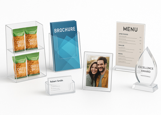
Retail displays, brochure stands, photo frames, menus, awards, and business card holders.
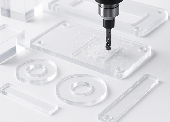
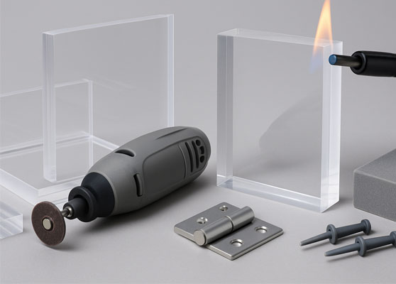
Cut, polish, and bond acrylic panels into precise custom parts using CNC, laser, and drills.

Celebrate client wins with custom acrylic awards highlighting top achievements.
 English
 French
 German
 Portuguese
 Spanish
 Dutch
Dutch Italian