Table of Contents
Color isn’t “just decoration” in acrylic. It sets the vibe, sells the product faster, and keeps your brand consistent across batches. If you’re building retail fixtures, signage, organizers, or OEM parts, color also affects how the piece lights up, how edges look after cutting, and how the product ages in the real world.
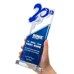
At Custom Acrylic Product, we support bulk orders, OEM/ODM, and repeat production for retailers, distributors, and brand teams.
Color and Purchase Decisions
When shoppers scan a shelf, they don’t “read” first. They react. Color does most of the heavy lifting in that first second. If your acrylic display sits at the cash wrap, you want a color that pops under store lighting and still looks clean on phone cameras (because customers will film it).
Real-world scenarios where this matters:
- A tinted riser that makes premium skincare look “calm and clinical” instead of loud
- A neon-style acrylic sign that needs to look bright, not cheap, on TikTok
- A countertop organizer where “clear” feels hygienic and high-end
If you sell into retail, treat color like a conversion lever, not a last-minute pick. It’s a simple way to reduce “decision friction” for shoppers and make your product feel intentional.
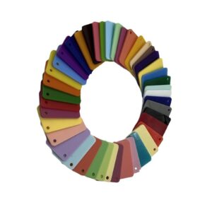
Brand Color and Color Coding
Brand owners love acrylic because you can push color in different ways: transparent tint, translucent panels, solid colors, prints, even layered builds. That gives you options for:
- Brand color matching (Pantone targets, master samples, delta-E tolerance)
- Color coding for SKUs (size, scent, “new vs classic,” seasonal drops)
- Private label consistency across multiple product lines
If you’re an OEM buyer, this is where things can go wrong: one supplier matches “close enough,” and your next reorder shifts. You don’t want that. Lock the color spec early, approve a physical sample, then run production with QC checks.
You can see common B2B categories like custom acrylic displays and custom acrylic signs where color consistency directly impacts brand trust.
Translucent Acrylic and Backlighting
Acrylic does something glass and painted metal can’t do the same way: it carries light through the material. That’s why translucent acrylic feels “deep” and premium when you edge-light it or backlight it.
Use cases that benefit immediately:
- LED menu boards and brand logos
- Light-up message boards for promos
- Display shelves that glow without showing wiring
If your design includes LEDs, choose the color with lighting in mind. The same “blue” can look icy, warm, or muddy depending on diffusion, thickness, and LED temperature.
LED Hot Spots and Light Diffusion
Hot spots happen when you see individual LED points through the acrylic. It screams low quality.
You fix this with diffusion strategy, not wishful thinking:
- Use diffuser grades (or surface textures) to spread light
- Increase distance between LED and panel when you can
- Pick translucent tones that hide hardware better than crystal-clear tints
Here’s a practical matrix you can hand to your team:
| LED lighting goal | Acrylic color type | Diffusion approach | What it prevents |
|---|---|---|---|
| Even glow for signage | Translucent (opal / frosted look) | Diffuser sheet or satin finish | LED hot spots |
| Sharp edge-lit logo | Clear or lightly tinted | Polished edges + controlled LED placement | Dull edges, low “sparkle” |
| Premium “soft light” shelf | Light tint + translucent blend | Diffusion + thicker panel | Patchy brightness |
If you’re making illuminated units, start from the lighting plan, then pick the color. Don’t do it the other way around.
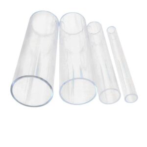
Light Transmission by Color
Light transmission is the silent boss of acrylic color design. Even if two pieces look “similar” in daylight, they can behave totally differently under LEDs.
A typical reference point: clear PMMA often reaches around 92% visible light transmission in datasheets. Once you add tint, opacity, texture, or thickness, that number drops. That drop might be exactly what you want.
| Acrylic color category | Transmission level | Best-fit scenarios | Common buyer pain point |
|---|---|---|---|
| Clear | Very high | Luxury display cases, clean organizers | Shows dust, fingerprints |
| Transparent tint (smoke/amber/blue) | High–medium | Premium electronics stands, branded trays | Color shifts under warm LEDs |
| Translucent (opal/frosted look) | Medium–low | Backlit signs, diffused light panels | Can look “flat” if too thick |
| Opaque solid | Low | Directional signage, bold brand blocks | Surface scratches show more |
If you sell on Amazon or run an ecom store, test the color under a ring light and under cold office LEDs. That’s where surprises show up.
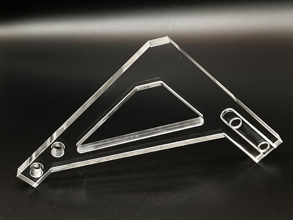
Fabrication and Edge Finishing
In acrylic, edges are part of the design. A perfect color can still look off if the edge turns cloudy after cutting.
Color decisions affect finishing choices:
- Clear and light tints show edge haze more
- Dark colors hide edge haze but show scratches
- Layered colors can create a “premium stack” look when edges are polished
If you plan laser cutting, CNC routing, flame polish, or diamond polish, tell your fabricator early. It helps them recommend the right sheet type and finishing route.
For sheet-driven color projects, start from custom acrylic sheets so the material grade matches the look you’re chasing.
UV Resistance and Weathering
Outdoor and window-facing products live in a tougher world. UV and heat can push yellowing or fading over time, especially for certain colors.
Common outdoor scenarios:
- Storefront signs that sit in sunlight all day
- Event setups with clear chairs or outdoor fixtures
- Window displays where the acrylic becomes part of the brand image
If your product goes outdoors, treat UV resistance like a spec item, not a “nice to have.” It protects returns, reviews, and reorders.
Color Shift and Aging
Even indoor products age. Cleaning cycles, heat, and light exposure can slowly move the color.
This is where grown-up specs help:
- Define what “acceptable” looks like (delta-E range, master sample)
- Use accelerated checks for long programs (especially for repeat SKUs)
- Track batch-to-batch consistency so reorders don’t drift
If you’re running OEM/ODM, this protects your TSM (time-to-market). You avoid the late-stage “this color looks wrong” panic that triggers rework, missed launch dates, and stuck inventory.
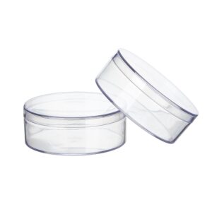
Stain Resistance and Cleaning
If your acrylic product touches hands every day, color and surface finish decide how it looks after month three, not day one.
Typical “high-touch” items:
- Bathroom vanity trays
- Makeup organizers
- Food display covers and storage boxes
Clear shows smudges. Dark shows scratches. Translucent hides both better, which is why many brands pick a soft frosted look for organizers and trays.
If you sell storage and packaging, check custom acrylic boxes for formats that work well with translucent colors and clean edges.
Color Specs for OEM/ODM Production
You don’t need a 30-page spec to get color right. You need the right few controls, written clearly, so sourcing and production stay aligned.
| What to lock | What to provide | What you get back |
|---|---|---|
| Target color | Pantone / sample / photo + lighting notes | Color match plan |
| Visual style | Clear vs tint vs translucent vs opaque | Material and finish recommendation |
| Lighting conditions | LED type, temperature, placement | Less rework on illuminated parts |
| QC checkpoints | Master sample, batch check method | Stable reorders |
If you want a clean process, these pages help your team move faster:
- How to customize for the typical OEM flow from concept to sample to bulk
- Acrylic fabrication for methods like cutting, polishing, printing, and assembly
- Quality control for inspection thinking that keeps reorders consistent
If you’re building a new display line, refreshing signage, or scaling a private-label program, color is one of the easiest places to win—because it touches branding, perceived quality, and production stability at the same time.
When you’re ready to scope the next batch, use Contact and share your target color, usage scene, and order volume range. We’ll help you pick the right acrylic color strategy and keep it consistent through sampling and mass production.